Pagination
LFUI 5.2.0
LFUI 5.1.0
LFUI 4.2.0
LFUI 4.1.0
Use pagination to let the user where they are in a flow consisting of several pages.
How to use
Our pagination is one of the components which have gone through the most design iterations and discussions. Please refer to Design rationale below for why this particular design has triumphed over alternatives.
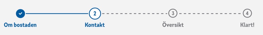
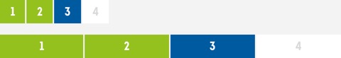
Layoutwise the pagination is really simple: the number of pages available is listed with a visible number for each page. The styling of the numbering depends on where in the flow the user is:
- Previous pages have a white background with a blue text. By default the page number is clickable and lets the user return to that specific page. On hover the number is underlined.
- The current page has a blue background with a white text.
- Upcoming pages have a white background and grey text.
In responsive mode for small screens the pagination is full row width.
When we determine number of pages included in the numbering we count the number of pages from the start of the service, including the receipt if such exists. We do however not include "intro-pages" on which the user submits initial data needed for the service (this as there are often many ways to enter such a service, and the most common way is usually as part of a product page on lansforsakringar.se).
Although we number the receipt page we do not show the pagination on the receipt page. This is as a pagination here wouldn't provide any value to the user, as they've finished the flow and wouldn't be able to go backwards in the flow as the data has been submitted.
Modifier
One modifier exists for pagination; the possibility to be able to navigate to a previous page can be turned off if it could cause more problems than benefits for the user to navigate back. For example, it is used in such a way in flows where the user has to identify/sign with BankID in the middle of a flow (which in turn should be avoided if possible, but that isn't always possible for architectural or security reasons).
Design rationale
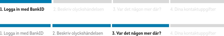
Over the years a number of alternative designs (all more descriptive) have been tested in both qualitative and quantitive tests. To the surprise of many the scaled down version in use has outperformed the more descriptive versions in all tests. Below are two examples of alternative versions which have been tested, and failed.
a/b-tested version
The version below was used in an a/b-test during autumn 2019 and resulted in a lower conversion rate than the pagination in use.
Qualitative
When the current version of pagination was designed there was a lot of discussion in the design team as whether to use it or a more explanatory version. A number of sketches of different alternatives were tested, and the current design was chosen as the winner after a number of discussions and user tests.

How to use
Pagination is built with list HTML elements so screen readers can announce the number of available links.
Variations
There is two variations of pagination. One built with links which you can navigate back in and one built without links which you can't navigate in.
Links
Use a wrapping <nav> element to identify it as a navigation section to screen readers and other assistive technologies. n addition, as pages likely have more than one such navigation section, it’s advisable to provide a descriptive aria-label for the <nav> to reflect its purpose.
<nav aria-label="Pagination Navigation">
  <ul class="pagination">
    <li class="page-item"><a href="#foo" class="page-link" aria-label="Goto Page 1">1</a></li>
    <li class="page-item"><a href="#foo" class="page-link" aria-label="Goto Page 1">2</a></li>
    <li class="page-item active"><a aria-label="Current Page, Page 3" href="#foo" class="page-link" aria-current="true">3</a></li>
    <li class="page-item"><a href="#foo" class="page-link" aria-label="Goto Page 4">4</a></li>
  </ul>
</nav>
Without Links
<ul class="pagination pagination-static">
  <li class="page-item"><span class="page-link">1</span></li>
  <li class="page-item"><span class="page-link">2</span></li>
  <li class="page-item active"><span class="page-link">3</span></li>
  <li class="page-item"><span class="page-link">4</span></li>
</ul>
Accessibility(Link variation)
For sighted users, it’s clear that the numbers will help him navigating different pages. But for an AT user, it’s completely different. By using aria-label, we can add a label to each link, so instead of hearing the screen reader saying Link, 1 it will be Link, Goto Page 1 .
To indicate which element is active, we need to tweak the value of aria-label by something like Page 3, Current page . Also, we will use aria-current=true for that.
Please Note
Pagination should be stretchy on small screens. There is no built in support in the component for that. However there is a class pagination-sm-flex you can add to make it work( see example at the top)