Specific use text styles
Our forms and tables make use of special text styling, intended for use only in that context. This page describes those.
How to use
This chapter describes text styles with specific use cases, such as in forms and tables. Below is which you can see the different types of text styles used in forms and the relation to each other and other form elements.
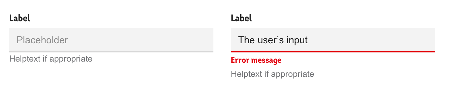
Labels
Labels can be used in tables as well as forms. In tables they are used as a headings for columns, and in forms they help help the user know what to enter in the adjacent form element (please see form element grouping for a thorough explanation). Labels should not be used for anything except this.
Labels are written in Intro Cond bold, 16px and colour #222222.
In some forms (like KYC and "Hälsodeklaration") we need to ask questions in sentence form rather than short and snappy labels. In those cases the boldness of the labels might reduce readability over time, so we recommend using Arial 16 px normal weight in those cases instead.
Input description/helptext
At times you might want to give some context to the expected input or provide information on GDPR-compliance of the data provided by the user. Then input description/helptext/meta (same thing, many names) is your friend - read more about how to use it in form element grouping.
The styling of input description is Arial 14px with colour #6B7070.
Placeholder text
Placeholder text is the optional text in the input area to help the user see the expected format. Again, the detailed description can be found on the form element grouping-page.
Placeholder text is rendered in Arial, 16 px and #8B8B8B.
Error message
Error messages are displayed in Intro Cond, bold weight, 14 px and #E30613.